What inspired the FW 25/26 Collection?
This year, based on all the research we have conducted, we realized that it is quite fun to stimulate those who observe the collection’s fabrics by playing with the details. We also noticed how the subjectivity of those who look at the fabric can sometimes lead to a result that is completely different from our initial intentions…
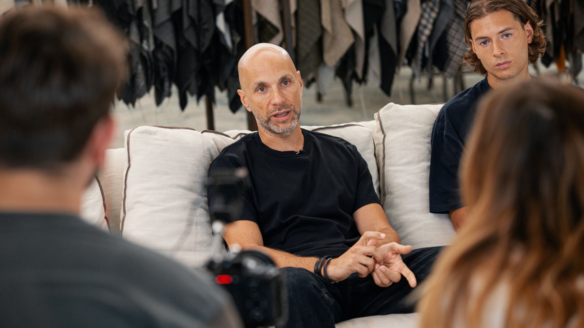
We discussed it with Saimon and Gianluca, both Technical Designers at Cangioli 1859, who shared the approach the entire team took for the Fall/Winter 25/26 season.
Watch the full video interview!
Read the full interview
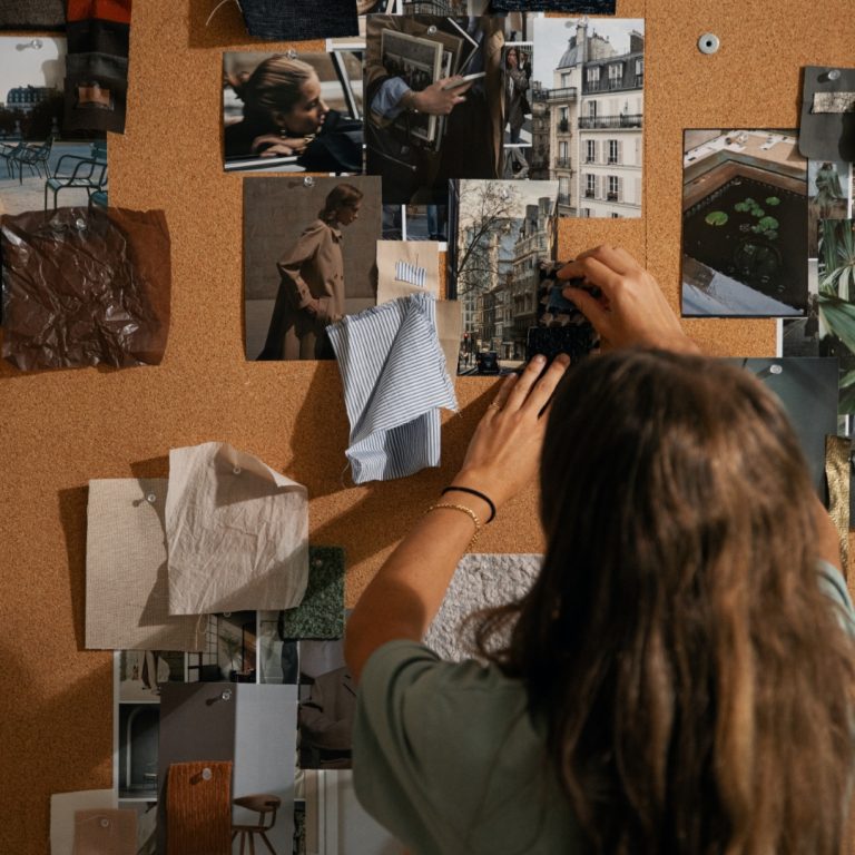
An eclectic approach
I would describe the preparation of this year’s collection as a search for ideas, not based on a single source. We let ourselves be carried away and played a bit with the inspirations.
The role of vintage
We explored various situations related to some vintage garments, looking for stimuli and insights that could draw something from heritage, from the past, which could either be renewed or offer continuity to a new sense of modernity.
Travels and cinema
We took some trips, focusing on what the people in the streets conveyed to us. We concentrated on how certain cities, or specific environments, might have appeared in different years or in the past, seeking the mood those places transmitted.
We also found inspiration in cinema, and from one particular movie emerged one of the main themes of the collection. Escape from Pretoria was indeed the spark that ignited this exploration of details. We were struck by how the protagonist, observing the guard’s key, recreated its design through a skyline so as not to be recognized as the profile of a key.
Shaping the concept
his idea was very stimulating and prompted us to further develop this concept of searching for hidden details. By piecing together all these elements, like in a puzzle, we combined what emerged from the cinematic research, the travels, and the exploration of vintage garments.
“It is precisely through this blending of different elements that we built the image of the winter collection.”
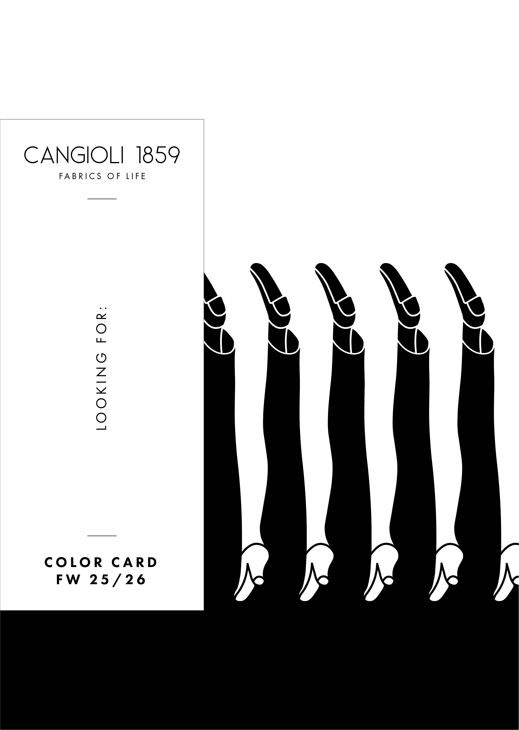
A call to look closer
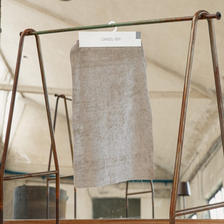
All these building blocks we have put together serve as an invitation for our audience to understand where we started from, and to encourage them to touch the fabric, to look at it closely. This is why our color chart is called “Looking for:”
“It is an invitation to go beyond, to search for the details, and to piece them together without stopping at the mere surface image.”
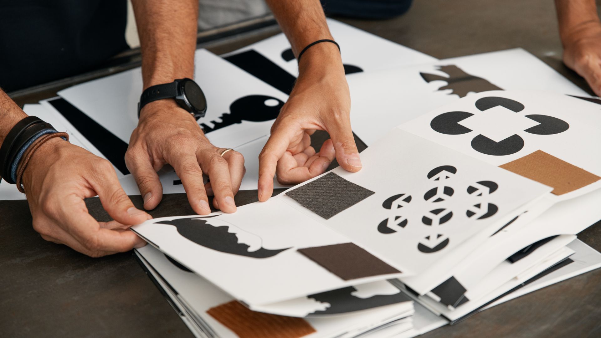
The dualism in the fabrics
Just as one plays with puzzles, we place the necessary pieces to complete the final image, the hidden message behind all the details we have inserted into the fabrics.
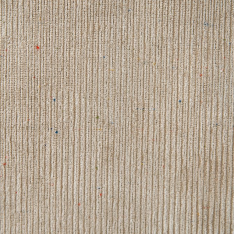
This duality of perspectives, between surface image and detailed image, can emerge in many things, and in this case, it emerges in our fabrics.
We have indeed developed a play of technical skills that allows both perspectives to be seen. A duality that becomes visible only by delving deeper, by getting closer, and by searching for the detail that would otherwise go unnoticed from a superficial analysis.
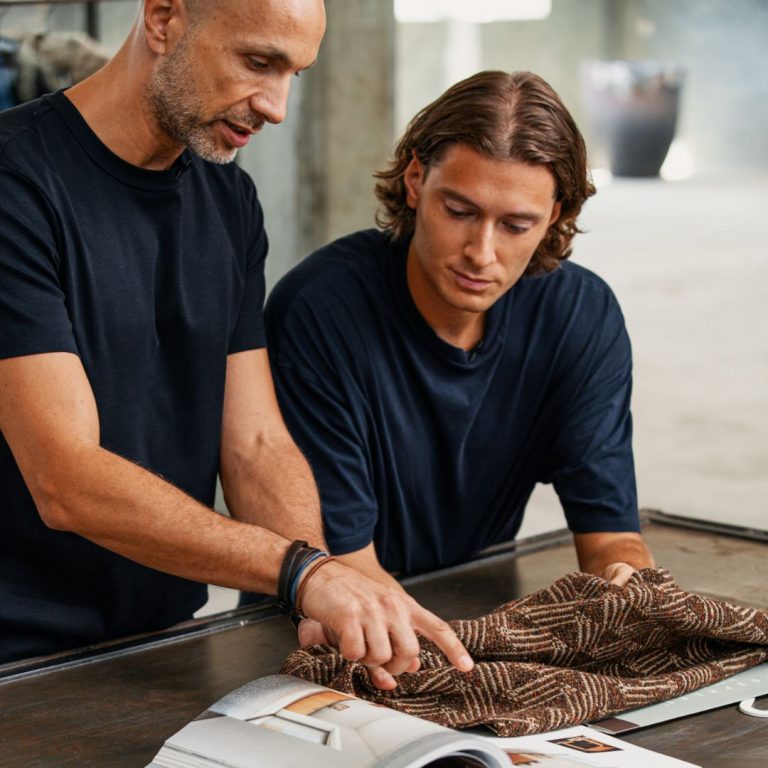
A work of technicalities and precision
From a technical point of view, for example, we have replicated the folds and abrasions of certain types of work that, in reality, are not structural but designed. The fabric seems folded or crumpled, but when you look closely, you realize the fabric is intact: it is the effect of the weave that creates this impression.
Perfecting this kind of technical detail was no easy task, as we wanted to achieve a truly “borderline” result—visible only to those with a deeper interest. This required a great deal of development and study, both in terms of weaving and in the choice of yarns, because during the prototype development, we often found ourselves with results that were either too subtle or excessively bold.
Going beyond appearance
Our goal was to find a balance in which the appearance conveyed a message, while further investigation could reveal others.
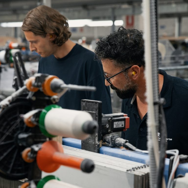
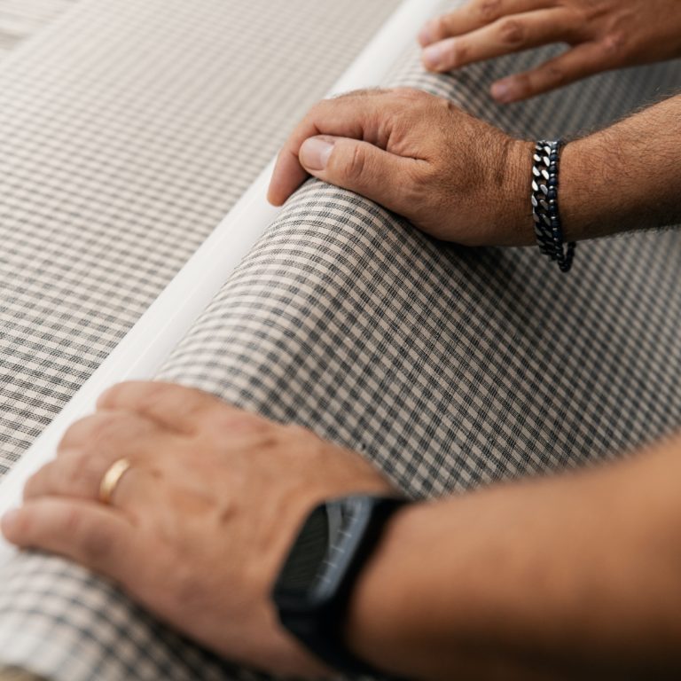
This concept required a lot of work and close collaboration with all the various production stages: from the choice of thread, to the weaving, all the way to the finishing. Our constant presence on the field was crucial, going to the weaving mills to observe what was being produced, because it is often there, not at the desk, that ideas emerge.
Let’s say the message we want to convey is somewhat of a provocation: trying to be less superficial, not stopping at mere appearances, but taking time to delve into the details and understand the hidden elements that truly make a difference compared to what surrounds us.
A deeper message, one that goes beyond the fabric itself.
Looking for:
“Looking for:” is an open invitation to change perspectives, an encouragement to look beyond appearances and discover a world of wonders hidden behind gazing eyes.