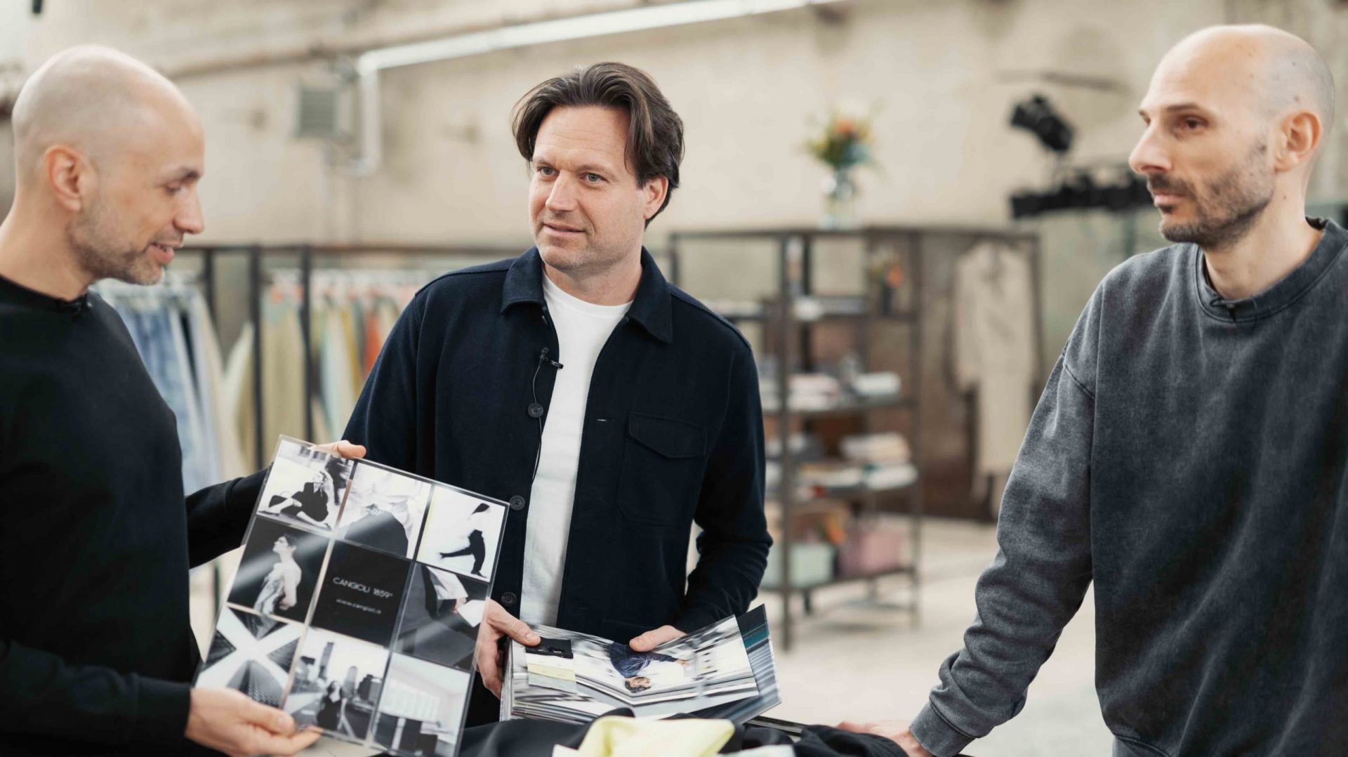
The making of our Spring Summer 25 Collection
Recently we caught up with Saimon, Alberto and Alessandro to delve into the essence of our SS 25 Collection & Color Card project.
They revealed how it embodies and celebrates the pivotal role of human creativity at Cangioli: from design to production.
Watch the full video interview!

Read the full interview
Why is the SS 25 Color Card called The Glitch?
The concept of “the glitch” as a random element or error, which can be expected or unexpected, intentional or extremely spontaneous, in the context of the collection was linked with the machinery that can have a malfunction and the man who can make a mistake.
In the combination of these two elements, we realized that unique things are often born with their own characterization or distinctive element, which we wanted to enhance and propose as a product.
How did you manage to convey this concept to the product?
There are various techniques to put this concept into practice. It can be a matter of finishing, which includes processes that are inappropriate for that specific type of fabric, but give it uniqueness: these folds or deformations, which are the characteristic effect of the fabric, are not homogeneous but very random and unpredictable.
There is an explicit desire to make this error an actual attribute.
What do you think makes the difference in this process that leads you to achieve such sought-after effects?
It is also important the person who works on the processing itself: maybe we think of one thing and the operator puts his own spin on it, because in the end these processes are almost handcrafted.
In fact, it is the operator who gives the machine times and settings that are personal and which then contribute to the final result.
In some cases we also hear the answer “don’t worry, this is your wish, we’ll take care of it“.
How did you choose to present and narrate the Collection?
There are five macro families of fabrics.
– New York –
This family is slightly reminiscent of the 1990s. The colors are predominantly white and black, with a touch of lime. It is the American metropolitan taste – but not the modern, current one – therefore formal, clean, rigorous, tending to suit fabrics.
The whole world of worsted wools is present, cold wools in both pure wool and polyester. Cleanliness and minimalism are therefore present here, also through three-dimensionality of weaves or light, as in this case lurex.
– The College –
The second group recalls a purely cotton theme, where there are many pinstripes on shirt and Oxford bases, purely off-white and blue or light blue, occasionally a touch of green. The reference is that of the American college, a sporty world related to cotton: it is the interpretation of stripes and classic shirts with a very energetic treatment that gives it these more contemporary and washed out aspects.
It is certainly an unusual thing to see this kind of wash on a college uniform concept, where instead we are used to imagining the rigorousness and conformist look that goes from jackets to shirts to a proper kind of attitude. So here comes an attempt to give a slightly more contemporary look to something that is nonetheless institutional and standard
– Paris –
The next group is inspired somewhat by the French world. The chromatic taste starts with grey and goes through all the nuances of green with a very cold touch. The blue accents are proportionate to the intensity of the other colors. In terms of fibrousness, here too we find linen and melangiature, situations that give three-dimensionality and movement to the fabric.
The washing is present, but in this case it is no longer an exasperated one, but a washing that simply gives movement to the surfaces in order to emphasise the three-dimensionality of the yarns, the lurex inserts and the patterns which – although low – still give movement to the fabric.
– Amelia –
The fourth group is inspired by the 1920s and Amelia Earhart, recalling travel and adventure. There are in fact colors reminiscent of the safari, the presence of jacquard, linen structures, very warm tones, tending towards tobacco and camel, some touches of light blue – but not too saturated – at the shirting level.
There are always wavy and washed aspects with a linen component also quite predominant. There is a lot of research into three-dimensionality through washes or with other techniques involving weights and transparencies. So we go from light weights to outerwear things like this water-repellent jacquard, or melangiature.
– Audrey –
The last group was named Audrey and refers to the 1950s both in terms of color and design. Here all the pastel nuances return and make up for the fresher and funnier part.
We have three-dimensional effects linked to the yarn and Vichy patterns that are made to have a certain three-dimensionality, which somewhat ties the whole collection together.
The Glitch
Would you like to take a closer look at the SS 25 collection, request samples or a copy of The Glitch color card?
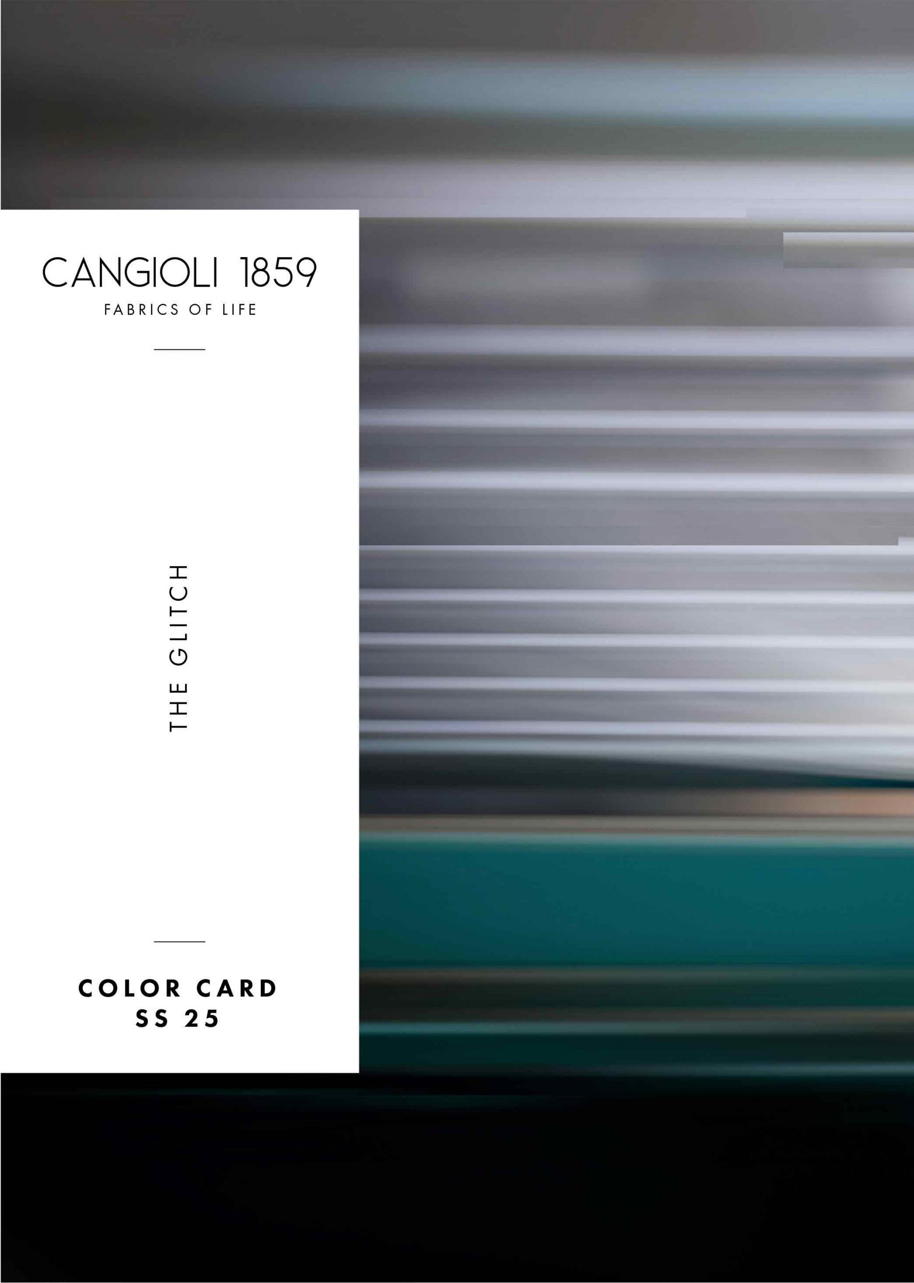
The Glitch
Literally means “random error”. In some forms of digital art and design is interpreted as a deliberate imperfection, intentionally used to create a specific aesthetic effect.