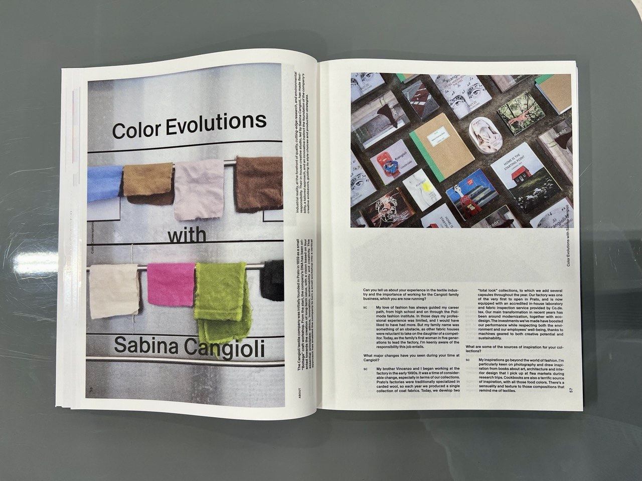
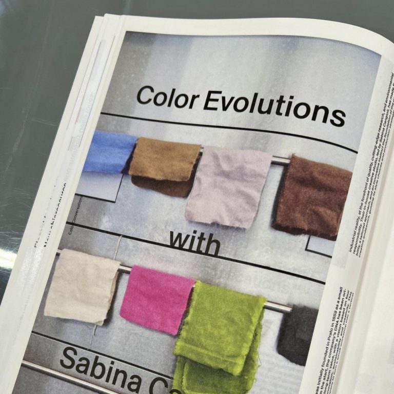
At the Première Vision Paris SS 25 trade show, the PV Color Book, an editorial work dedicated to reflections on color and its recent evolutions in the fashion industry, was released. Among its pages, an exclusive interview with Sabina Cangioli has been included, in which she reveals the profound research work behind her role as Color Specialist.
Can you tell us about your experience in the textile industry and the importance of working for the Cangioli family business, which you are now running?
My love of fashion has always guided my career path, from high school and on through the Polimoda fashion institute. In those days my professional experience was limited, and I would have liked to have had more.
But my family name was something of an obstacle, as other fabric houses were reluctant to take on the daughter of a competitor. Today, as the family’s first woman in five generations to lead the factory, I’m keenly aware of the responsibility this job entails.
What major changes have you seen during your time at Cangioli?
My brother Vincenzo and I began working at the factory in the early 1990s. It was a time of considerable change, especially in terms of our collections. Prato’s factories were traditionally specialized in carded wool, so each year we produced a single collection of coat fabrics.
Today, we develop two ‘total look’ collections, to which we add several capsules throughout the year. Our factory was one of the very first to open in Prato, and is now equipped with an accredited in-house laboratory and fabric inspection service provided by Co.de. tex. Our main transformation in recent years has been around modernization, together with eco-design.
The investments we’ve made have boosted our performance while respecting both the environment and our employees’ well-being, thanks to machines geared to both creative potential and sustainability.
What are some of the sources of inspiration for your collections?
My inspirations go beyond the world of fashion. I’m particularly keen on photography and draw inspiration from books about art, architecture and interior design that I pick up at flea markets during research trips.
Cookbooks are also a terrific source of inspiration, with all those food colors. There’s a sensuality and texture to those compositions that remind me of textiles.
How do you go about creating your color ranges?
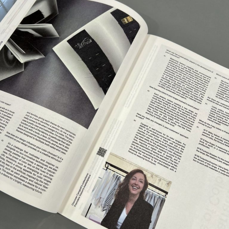
Each season, Cangioli comes up with an in-house color range, which we turn into a book and give to our customers as a collector’s item. It expresses the season’s theme, with a design that tells a story and showcases the colors. The creation of the color range is a real in-house team effort, involving both my creative studio and our graphic designers.
Diverse points of view are important to me, and I look for opinions from people of different generations to broaden and enrich our sources of inspiration. A feminine sensibility is particularly noticeable at Cangioli, as the entire color team is made up of women.
Once you’ve created the color range, how is the collection elaborated? How do you combine the materials and colors?
At the start of the season, we define the color range and simultaneously develop all the samples in ecru. Then we work out combinations by creating groups and families, giving each theme its own harmonies. Just as a name identifies a person, to me a fabric really comes to life when I assign it a color.
The process is pretty clear and instinctive. I’m mindful of the function of each of the fabrics, in particular their ability to work with a body, a face. Of course, we’re also aware of commercial requirements, and we propose themes designed to facilitate both sales and uses.
How does eco-design influence your color choices? Is it a constraint on your design process, or a creative stimulus?
It’s a challenge that motivates and inspires us. Alongside our eco-innovative techniques, we also develop palettes that convey a sense of naturalness.
The power of color lets us link hues to specific sensations, such as energizing or calming. Today, there’s a strong appetite for color ranges that rely less on the artificial, inspired by the natural world, such as plant greens and natural fiber shades. This appeal expresses a desire for a comfort zone, a desire for a bright, reassuring future.
What role has sustainability played in the development of your collections?
Balancing fashion creativity with environmental protection is no easy feat. However, as part of a vertical group with operations spanning weaving to finishing, Cangioli has always paid close attention to the environment. In terms of the impact of the production site, our factory is equipped with a photovoltaic power plant, and we were proud to have saved some 100 million liters of water in 2019, for example.
Almost 100% of the chemicals we use in our finishing plant are certified ZDHC (Zero Discharge of Hazardous Chemicals) Level 3. We are certified GRS OCS RCS RWS; European Flax for Linen and GOTS. With regard to raw materials, in 2023, 60% of our yarns and raw materials were certified, sustainable and organic.
How have the colors in your ranges evolved in recent years?
Each season, before creating a new range, we compare the ranges of the last two seasons, and study them shade by shade. This approach helps us visualize how the colors are evolving.
And for SS25, I can see that colors are becoming more and more whitened. We also see all the saturated hues losing their intensity, turning dirtier or more shadowy. Colors are less bright, more harmonious.
They’re moving closer to earthy, clay-like hues, and they’re definitely more tonal.
Have you seen any changes in your customers’ approach to color?
Cangioli is well-known for its color ranges. For AW24–25, we took an unusual risk—we presented 50% of the collection in black, with just a few touches of color.
Contrary to all expectations, the collection was very well received. I think customers were ready for this absence of color. Because that absence allowed the material to come to the fore, requiring a higher level of quality, and a greater elaboration of texture and relief. This decision let us concentrate on the essence of the fabric.
So black was working more as a shadow-effect, allowing the material to be showcased, with a focus on weaving techniques.
Which colors do you think are important for SS25?
We think blues are very important for next season. They’re moving away from their traditional association with sports and emerging as colors tied to a technological vocabulary.
Today, blue evokes AI, it creates a feeling of infinity. We also see the re-emergence in splashes of color of silver, invisible grays/greens and yellows. But these tones have an almost aged look, they’re more pastel, softer, calmer and less intense.
Are there any material/color combinations that you feel would be new and interesting to develop for SS25?
Linen, cotton, hemp, with slubbed and irregular yarns, and bourrette, in natural and green tones, pointing to a need for visuals with a natural quality, colors evoking the natural world.
Calm, clean shades in gray-green and silver tonalities for cellulosic and regenerated fibers with a low environmental impact.
What do the 4 key colors in Première Vision’s SS25 range convey to you?
No17 Milky Yellow: A creamy white, inspiring suppleness for everyday pieces, reminding me of panna cotta, the famous Italian dessert.
No12 Raw Sugar: A reassuring color that makes me think of earth or a caramel-flavored sweet, like profiteroles.
No19 Fuchsia Shadow: It’s the most sensual color in the range, like raspberry jam, elegant and luxurious.
No26 Turquoise Enzyme: Like a tasty macaroon, it’s the accent of this range. A matte-shiny combination to work with materials in surprising volumes.