The story of our Fall Winter 24.25 Collection
This year, we embraced a bold challenge: to craft a collection primarily composed of blacks, grays, and blues.
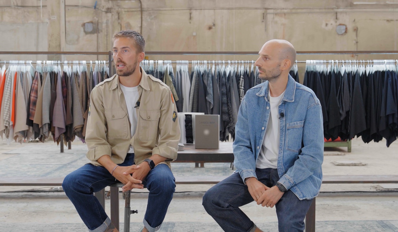
Let Lorenzo, our Sales Area Manager, and Alessandro, Cangioli’s Product Designer, tell you the story that brought this one-of-a-kind collection to life.
Read the full interview to have more insights
How did you connect the concept of light to an entire collection?
L: For the Fall-Winter 24.25 collection project we started from the idea of using a contrast between matter and light. We used and incorporated light to some extent throughout the collection.
So in each family, there is a variety of techniques, including coatings, laminates, and the use of lurex thread in various ways.
In the Color Card Matter of Light we used four different types of materials that allowed us to convey this contrast between light and matter, which is the key element of this new collection.
A: We used materials that can evoke sensations, both tactile and visual, that relate to the entire concept of the collection.
How did you structure the collection and, consequently, also the FW 24.25 Color Card?
L: The first part of the Color Card is a summary of the families found within the collection. There’s a first section of more neutral colors with a touch of red. This first part is somewhat a continuation of the previous summer season. In this family, there are mainly cotton or linen blend fabrics.
The second part, on the other hand, is the more romantic, feminine, and fluid one. In this part, we find a significant presence of color as well.
The other three families are the main part where we find the grays, and the Melange part, which is essential, the elegant and clean black part, tailoring-wise, and the last one of blues, divided into a more sporty jeans and a continually cleaner, tailored section.
What is the hallmark of this collection?
A: The most important characteristic of this collection is the almost complete absence of patterns as we used to do in past seasons.
This has been replaced by light in all its variations throughout the collection and the use of the Melange effect, both in yarn-dyeing and through piece-dyeing techniques.
L: We are widely recognized for color and patterns. Making a significant part of the collection in blues and grays was a significant change.
A: Certainly, it’s something that gives you a signal and says, “Perhaps it’s right to go in that direction.”
Matter of Light
Wishing to take a closer look at the FW 24.25 Collection, request samples or a copy of the Matter of Light Color Card?